Moiq
Brand Identity
Identity for moiq capital, a new and vibrant disruptor in the Wealth Management space.
Moiq believes that Wealth Management is more than just revenue, performance, and gigantic institutions. It is ultimately a process that inspires, enables and connects people through honesty, transparency and trust.
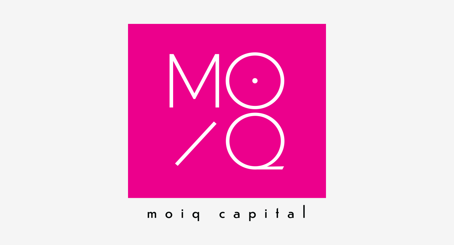
Moiq set out to build something fresher, better, more transparent, and more sustainable to meet the needs of this new generation of wealth.
We’re here to help you navigate complexity and risk to build your future.
— moiq
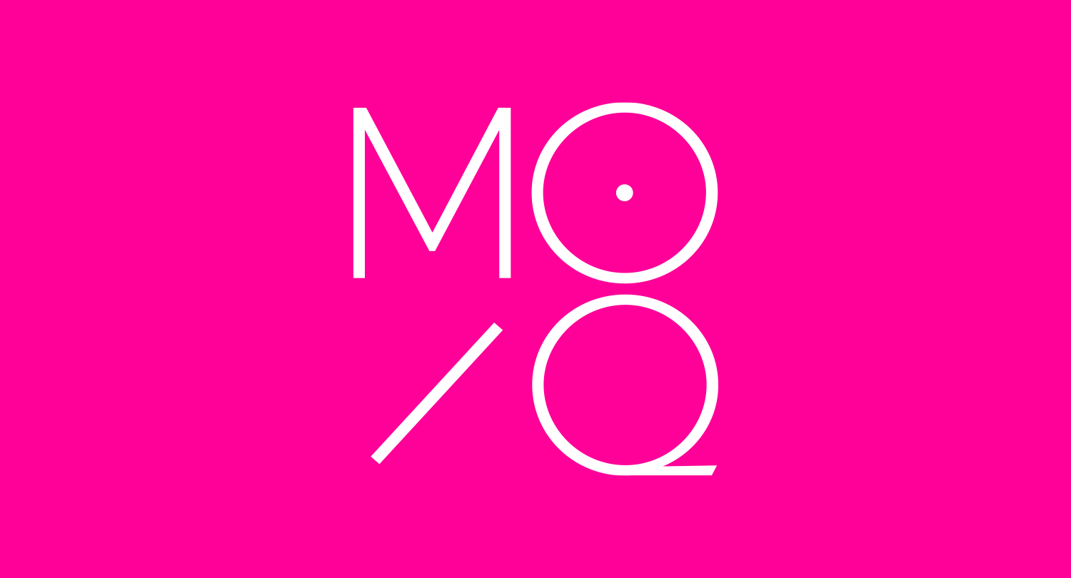
The MOIQ Pink
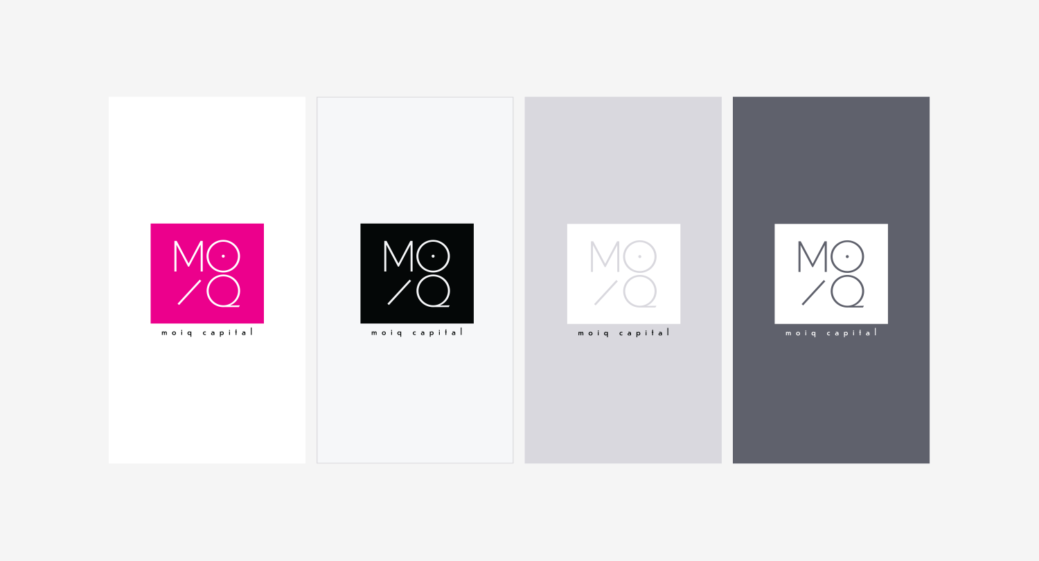
Magenta, the “pure pink”, was the perfect choice for Moiq — not only is it one of the three primary colors that generate the entire color spectrum, but its brightness and intensity make a bold statement that cannot be denied.
We believe we are the first company in the Wealth Management industry to use the pure pink as its main corporate color. It was a daring but easy choice for us to go with Magenta and you’re likely to witness us embracing the color in everything we do; even in what we wear!
— moiq
Symbolism

THE TARGET
The target’s concentric circles represent different levels of achievements, with the bullseye being the ultimate goal. Hitting the bullseye demands clarity, precision, and unfaltering focus.
— moiq

THE ARROW
The arrow symbolizes an increase in stock prices, and the investors’ optimism and confidence in the market’s potential for growth and profitability.
For us, it is also a symbol of progress, growth, and success!
— moiq
THE NUMBER EIGHT
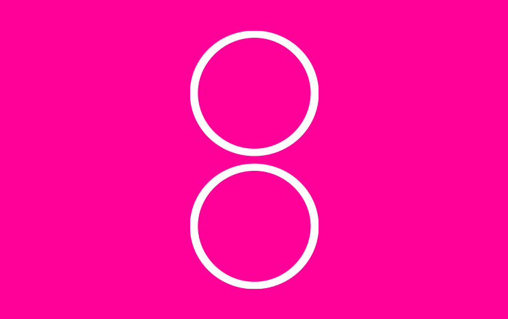
The number 8 is considered auspicious in many Asian cultures. In Chinese it sounds similar to the word for “prosperity” or “wealth”, and its symmetry is believed to represent balance and harmony.
— moiq

THE MATCH
The match is a catalyst — it ignites fire which generates light, warmth, comfort, and security. This is exactly what moiq is proposing: to light up our industry with something energetic and exciting!
— moiq
Client
Moiq Capital
Area
Finance
Discipline
Brand Identity, Logo Design

