Wiselike has launched its “Ask Me Anything” platform and “lined up a pretty interesting group of people who will answer questions, including the designer behind the Google logo, Ruth Kedar.”
No holds barred, Ruth was asked and answered wide gamut of design questions, from theory to practice.
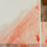
What are ways that color choice may negatively affect a design? What causes the phenomena of ‘vibrating colors’, and what are ways to avoid it? What is most essential to keep in mind when coming up with a color scheme?
Color is a powerful visual element and we react to it very strongly. However, let’s not forget that our reaction to color is both objective (the mechanics of light and optics) and subjective (our personal experiences).
With that said, two main things come to mind when choosing appropriate colors for a project and they are both associated with context.
The first is cultural – colors in different cultures may have a completely different connotation and association. For example, white can mean purity in some places while it is symbolic of death in others. It is important to understand who your audience is and use color in a way that conveys the appropriate message you are trying to impact.
The second is utilitarian – color choice can either enhance or obfuscate elements in your project. There is no one solution for achieving the right balance, but you should select a palette that can help the eye focus on what is important and even create a story-telling hierarchy on the page. (What you want people to see first, second, etc.)
The interplay between colors for focal elements (graphic, icon, text, etc.) and background or adjacent colors should be such that it will allow your elements to be visible and thus impactful. One good tip is to squint and if the edges disappear you should probably choose another hue or shade.
As for vibrating colors, these occur most commonly when you place complementary colors (equal in value and intensity, but opposite in hue) next to one another. The workaround is to tweak one or more of these three elements in one or both of these colors to ensure they are not longer truly complementary.
How is kerning your fonts helpful in graphic design? Is kerning essential when designing for a client, and why? What are some mistake a new graphic designer might make when kerning?
If we simplify the shapes of our letterforms, we could say that in essence out letters can be categorized into three main shapes: triangles, circles and rectangles. So if you mixed them up but spaced them equally, two adjacent rectangles would appear much closer than two adjacent circles.
When we use a font family in any graphics program, the letters have a “base” kerning built in, but it is not foolproof, and if you take the time and look at the spacing between the letters you will see that although they may be equidistant (let’s say each letter is 2 points apart from another), the eye will perceive some letters as being too close to each other while others will seem too far apart. That is not only unpleasant to the eye, but it can also prevent legibility.
Beyond achieving better aesthetics, I believe that kerning is a great eye-training tool, and I found that taking the time to pay attention to kerning has trained my eyes to see better; my spatial acuity has improved to the point where I can be fairly (ok, very) accurate on a pixel level whenever I’m aligning elements, or choosing the right type size for a given space, etc.
As for whether kerning is essential when designing for a client, I would say no. Very much like all other tools of the trade, it should be used properly and in time even expertly. It should become second nature. Instead, I would say that it is pretty darn important – to you as a designer.
How important of a role does font have in graphic design? In what ways does font choice impact the success of a design, and what is most important for a designer to keep in mind during the process of choosing a font?
Every element we use in our designs has a role to play in creating an impactful piece of work. Whether it is pragmatic, aesthetic, or emotional, everything that goes into the design should add to the intended result you want to achieve.
That means that all the visual elements you choose to use, and how you lay them out, should all come together so that they are able to grab the initial attention of your intended audience (who is busy doing other things), captivate it (so they deviate from what they are doing in order to spend some time with it) and generate the intended action (join a movement, see a play, buy a product, eat healthier, etc.)
The rewarding part of design is taking the utilitarian aspect and elevating it so that it becomes a truly transformational experience for the user. When that happens the user will become an evangelist for the cause at hand and in a way a living and breathing extension of your work.
How do designers deal with sites that have stolen their work?
When you see your work somewhere, used without your permission or without the proper attribution to you, I suggest you take a moment before going ballistic. First, remember that whoever took it as his own, must have liked it. Bask in that for a split second. 😉
Then take a minute to assess the situation and what do you want done. Remember that it may not have been an intentionally malicious act, so I always advise organizing your thoughts before you act.
Copyright infringement is defined as the use of works protected by copyright law without permission, infringing certain exclusive rights granted to the copyright holder, such as the right to reproduce, distribute, display, or perform the protected work, or to make derivative works.
Was your work protected? Did your work clearly state that it is yours (did it have the © symbol, your name, etc., either on it or on nearby?) If not, make sure that moving forward you add them to your work.
Once you figure out what you want (stop using it or perhaps just attributing the work to you), I suggest contacting them and letting them know that this is your work and what you expect them to do. You may contact them directly or through an attorney.
If your cease-and-desist letter does not do the trick, you may need to take it to court. This may prove an expensive and lengthy process. If you don’t have access to legal representation, or the cost is forbidding you may want to look into joining a professional group.
I’ve had both successes and failures when it comes to dealing with my work being plagiarized, and what it has taught me is that regardless of the outcome I will not let it affect my creativity or passion for design.
Why is graphic design seen as an easy job?
That’s a good question. Perhaps it is a function of the proliferation of design tools, and the fact that almost everyone has easy access to them. And with today’s technology, you can whip up something almost effortlessly and make it look quite good, at least at first glance.
With that said, I’d like to point out that graphic design is not the only craft or profession that has the “easy job” label attached to it – any job can be perceived as an easy job by people who either know nothing about it, don’t appreciate the experience needed to do it well (in either schooling or practice) or are just trying to undermine it in order to score a good deal.
My question to you is why do you think graphic design is not an easy job? What in your own mind is the value of pursuing a graphic design education and practicing the craft?
Start articulating for yourself if and how graphic design is or can be influential, important or even essential to a project’s success.
Look around you or do some research and see if there is an underlying common thread among those projects that in your opinion are “good” versus “bad”. If you step back, what conclusions can you draw on what constitutes excellence in the graphic design field and what is required to achieve it?
Only after you articulate to yourself what is the value of what you do, and even what is the added value you bring to it, that you will be able to impart these ideas to others and give them better tools to understand and hopefully respect and even admire what you do.
How should a freelance designer ask for mentorship from an art director at a design firm?
I suggest just going ahead and asking. There’s nothing gained if you don’t.
In the worst case they’ll say no, and if that happens, don’t take it personally – mentoring requires a big commitment and that it is not always possible for many reasons.
If you are interested in working closely with a mentor figure, you could also consider an internship in their firm.
What does a company’s logo tell about the company itself? Can you tell anything about a company’s current status, or its future based off of their logos or their logo evolution?
It is true that a logo is an integral part of the company’s identity ¬and how it “moves” in this world, but I wouldn’t go so far as to imply that a company may be on the brink of extinction because their logo is old fashioned.
On the other hand, a company doesn’t live in a vacuum and as such is part of the culture and the time and place within which it operates. In order to thrive it needs to establish a healthy relationship with its workers, clients and customers and whoever else it interacts with.
And that is where identity work can be very useful – it is much more than creating a logo or a visual mark. It is the process the company needs to go through in order to clarify to itself what is its vision and brand promise and how best to communicate these ideas and distinguish itself in the world where it exists and as well as expand into new worlds it would like to inhabit.
Any disconnect between these ideas and how they are being communicated should be addressed as soon as possible; otherwise it may negatively affect the way the company is perceived and eventually affect its ability to succeed.
What are your methods for getting future employers to look pass your past accomplishments? You mentioned on Wiselike that you gained notoriety for designing the Google logo, but it could have possibly defined your work as a designer. How have you tried to get pass your accomplishments with Google and get other employers see the variety of skills you can bring to the table as a design artist?
Whenever I found myself either typecast or excluded from consideration I took matters into my own two hands, knocking tirelessly on doors until I found someone willing and interested to listen to my ideas or point of view.
And when it came down to it, I was willing to start from scratch whenever I was interested in entering a new field or learning a new craft.
Sometimes all it takes is to check the ego at the door, roll my sleeves, dive in and do the work.
My initial conversations are around whether this could be a good fit – weighing in the expectations on both sides – and seeing how my skills and past experiences (even if they are not directly related to the job at hand) can bring a unique value to the table.
If I believe I can be of value and that this could be a good experience for all involved I will articulate what is my rationale for thinking that this is a good idea.
I try to remember that getting through that door is no guarantee you’ll be asked to stay for long or that you will be invited back. It will be up to you to deliver on your promise.
How do you balance your personal touch with what the client wants? Have you ever felt as though you could have put more of your personal taste into a project to make it better?
My aesthetic, my sensibility, my approach, my perspective, my personal touch – all form an intrinsic part of my designs. However, the final product should not only be about me, but rather a reflection of the client’s brand and the people it serves. As such, my goal is to guide the client toward solutions that are true to the brand, its mission, vision, and values.